
Paint color has a sneaky way of changing everything, from mood and brightness to how tidy a room feels. A shade that looks perfect on a tiny swatch can turn moody, muddy, or blinding once it covers four walls. Smart choices come from balancing personal taste with what a space naturally does: the light it receives, the finishes that stay, and the atmosphere desired day after day. A clear process makes choosing paint feel far less uncertain.
Read the Room Before You Read the Swatches
Start by taking inventory of what already lives in the space. Floors, countertops, large furniture, tile, and even the view outside the windows all influence how a paint color will look. Warm wood floors can pull pink or yellow from a neutral, while cool gray tile can make a beige look dingy. Notice whether fixed elements lean warm, cool, or balanced, then choose paint families that cooperate.
Also consider the mood you want the room to create. Social spaces often feel welcoming with warmer tones, while bedrooms and bathrooms can feel calmer with cooler hues or soft neutrals. Instead of hunting for “a pretty color,” define three adjectives for the room—airy, cozy, crisp, grounded—and let that guide the direction. This quick read keeps you from falling for a trendy shade that doesn’t match the space.
Use Light to Predict Color Shifts
Light is the reason paint feels unpredictable. Natural daylight changes all day long, and artificial bulbs can skew a color warmer or cooler at night. A soft white can look bright and clean in morning light, then turn creamy or dull under warm bulbs. Pay attention to window direction and how much light the room actually gets, not how you wish it did.
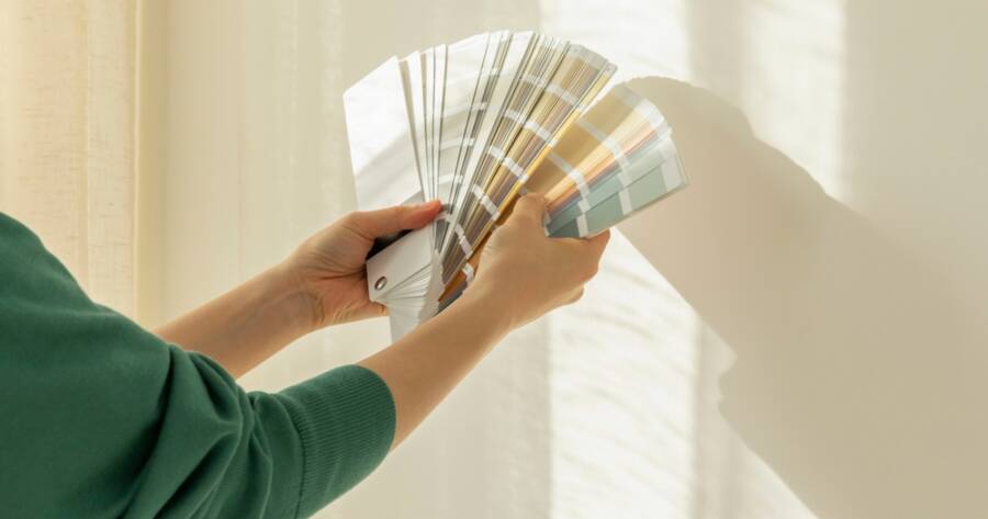
Test colors in the room, not at the store. Put large samples on more than one wall so you can see how the shade behaves in shade and direct light. Check it in the morning, afternoon, and evening, and view it with lamps on as well. If you want the smartest test, paint sample boards and move them around the room—this helps you see the true undertone without committing to the wall too soon.
Think About Size, Shape, and What You Want to “Fix”
Color can visually adjust a room’s proportions. Lighter shades tend to make a small space feel more open, while deeper tones can make a large room feel more intimate and intentional. If a room feels long and narrow, using a slightly darker color on the short walls can help it feel more balanced. Ceilings can also be visually “lifted” with a lighter shade overhead or “lowered” to feel cozier with a deeper tone.
It helps to decide what you want the paint to do. Is the goal to brighten a dim hallway, make a tall room feel less echo-y, or create a snug den? Paint is a design tool, not just a finish. When you’re clear on the effect you want, such as airier, warmer, calmer, or bolder, you’ll narrow choices quickly and avoid repainting later.
Build a Whole-Home Palette That Flows
A home feels more polished when colors relate from room to room. That doesn’t mean every space has to match; it means the transitions should feel natural. Pick a small, consistent palette, such as one main neutral, one or two supporting tones, and an optional accent for personality. This approach makes it easier to choose paint because every new decision connects back to a plan.
To keep things cohesive, use one consistent trim color throughout the house, especially on doors and baseboards. Neutrals can also act as a “reset” in halls or connecting spaces, making bolder rooms feel intentional rather than chaotic. If you love variety, change intensity instead of changing undertone—use lighter and darker versions of related shades. Flow is what makes your home feel designed, even if rooms have different vibes.
Understand Undertones, Saturation, and Finish Before Buying Gallons
Most paint mistakes come from undertones, not the main color family. Two “greiges” can look wildly different because one leans purple and the other leans green. Compare swatches next to a true white and a true gray to reveal undertones more clearly. If a color suddenly looks pinkish or greenish beside a neutral reference, you’ve found its hidden personality.
Saturation matters too. Muted colors tend to feel calmer and more timeless, while highly saturated shades can feel intense across a large surface. Also consider sheen: flatter finishes hide wall texture and feel soft, while a higher sheen reflects more light and can amplify flaws. Match finish to the room’s needs—durability in kitchens and kids’ spaces, a softer look in bedrooms and living rooms. Getting this right prevents the “why does it look so shiny?” surprise.
Make Sampling Foolproof and Decision Fatigue-Proof
Narrow your options to three to five colors per room, max. Anything beyond that turns into a blur and makes every choice feel wrong. Paint bigger samples than you think you need, as tiny squares don’t show how the color behaves at scale. Place samples near furniture, textiles, and flooring so you can see whether the undertones fight or blend.
Create a simple decision checklist: Does it look good in morning light? At night with lamps? Does it complement the fixed finishes? Does it match the mood words you chose? If a color only looks good in one lighting condition, cross it off. Once you choose a winner, buy the smallest amount first and test again, especially with deeper shades. Sampling feels tedious until it saves you from repainting an entire room.
A Color Choice You’ll Love Living With
The best paint color is the one that supports your everyday life. It should feel right when the room is messy, when it’s styled, when it’s sunny, and when it’s rainy. A simple process, such as reading the room, respecting light, planning flow, and testing properly, turns paint selection into a confident decision instead of a coin toss.
Once you find a palette that works, keep notes: brand, color name, finish, and which room it’s in. That little record makes touch-ups and future projects dramatically easier. Paint can be the fastest transformation in your home, and with the right approach, it becomes a lasting upgrade you won’t second-guess.